Tribe Onboarding
While the future of work continues to be unclear, with bosses wanting to go back to the office, feeling the risk of retaining and attracting top talent, workers want to work from anywhere and will pass on in-person only opportunities. Tribe comes as a better way to work online, bringing the presence of the office work and keeping the remoteness and privacy of work from anywhere.
At Tribe, users can connect in a call with others users within a single-click, send video or audio messages to a specific users or to a group, or enter into a space to work with whoever is in there.
Creating your tribe
When I joined Tribe, account creation flow wasn’t good, it was confusing to users and the UX was poor, resulting in a high rate of abandonment due to these problems.
As Tribe had recently created their app, it also needed a quick way for users to create their account, understand what Tribe is and creating their own tribe - something like your company space in Tribe.
Research method
Desk Research
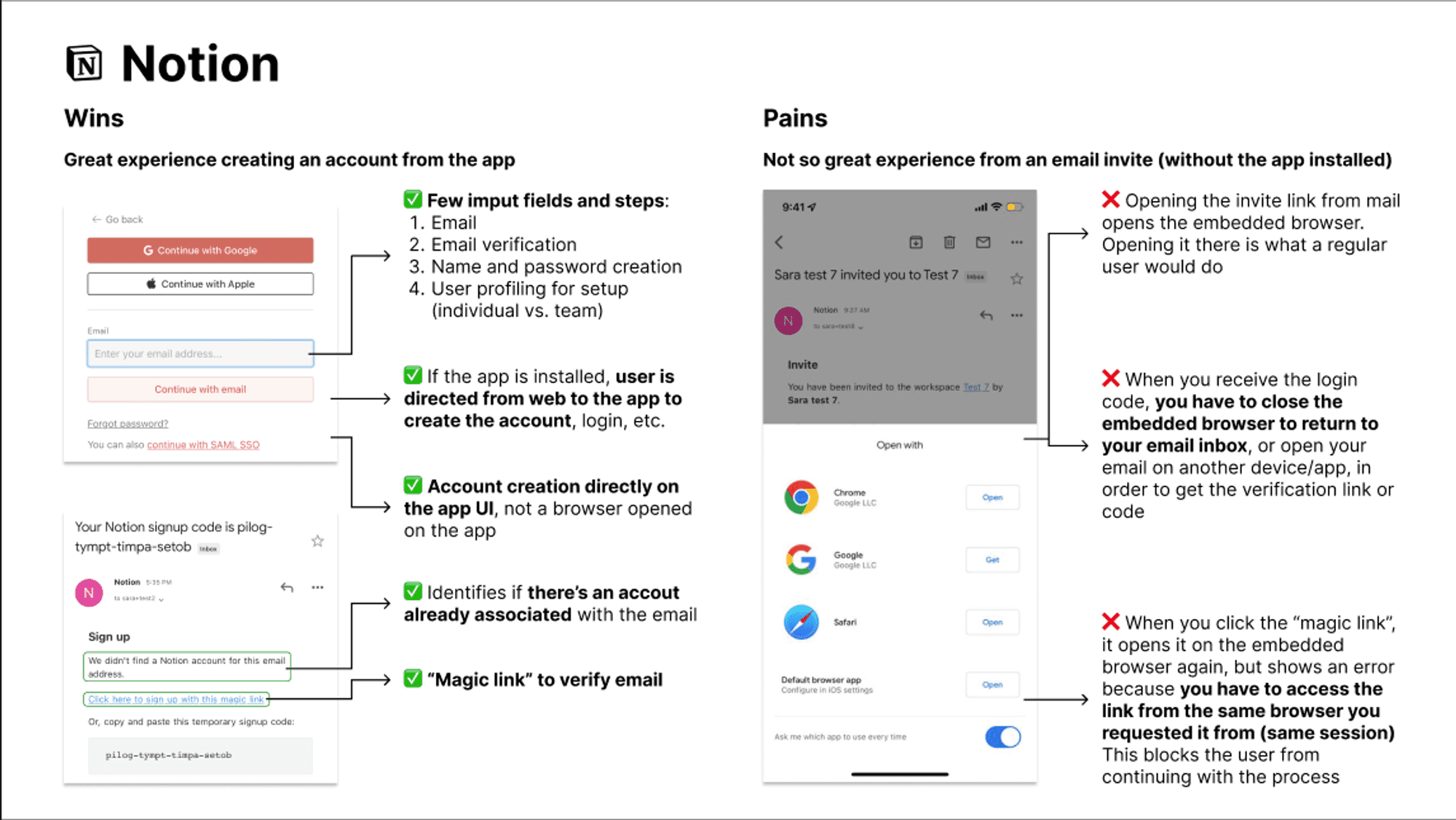
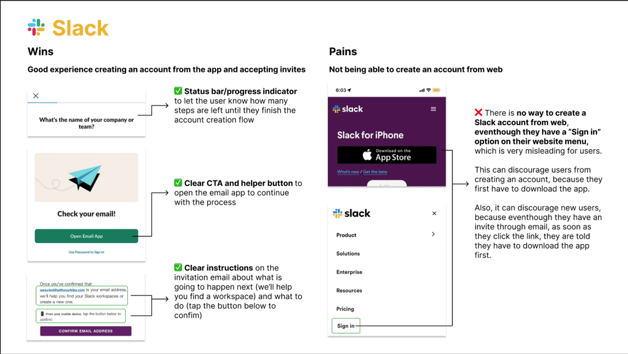
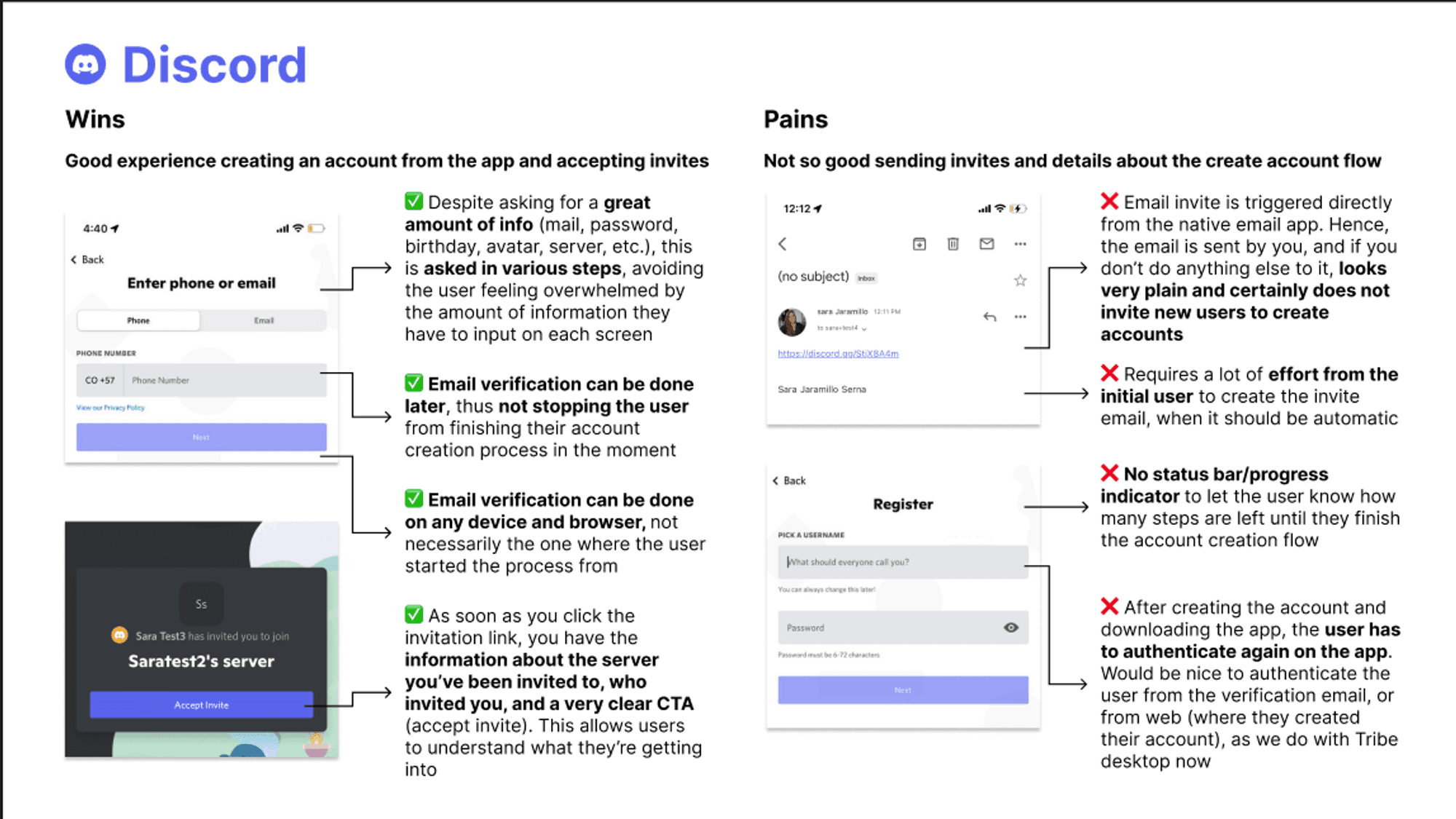
Competitor research:
Account creation from the app
Account creation from web
Account creation from link invite
Best practices (UX wise)
We wanted to answer:
How does the onboarding work on other apps?
When are you prompted to download the app?
How does it work when you download it on your own vs when you are invited
What does the flow look like when you already have the app, but haven’t created an account yet?
Can you create an account from the app itself?
Does creating the account on the web trigger the app download at the end?
Findings
For our research, we used 3 well-known platforms: Desktop, Slack and Notion, and we organized them in a simple Wins vs Pains method, as you can see below:
From the outcomes, it was easy to list some best practices and recommendations to apply in our own flow:
Explain the benefits of creating an account to incentivize users to go thorugh the process
Prompt to download the app from the account creation flow
Use the app’s UI for the account creation flow, instead of an embedded browser, and redirect users creating accounts from web to the app if already installed
Allow users to continue with the account creation process, doing email verification later to finish the registration process one “one sit”, without changing contexts (apps, tabs, etc.), hence reducing the risk of abandonment
Have an option to show the typed password, to avoid anxiety and uncertainty for typos
Clearly identify and explain field errors, even before the user has clicked “continue”. This could potentially avoid the frustration of completing the requested information and then being sent back to correct it
Have multiple steps -but no more than 4-, instead of multiple things on a single screen. Also, show users a progress bar to allow them to know what’s going on and how much is left to finish the process
The new flow
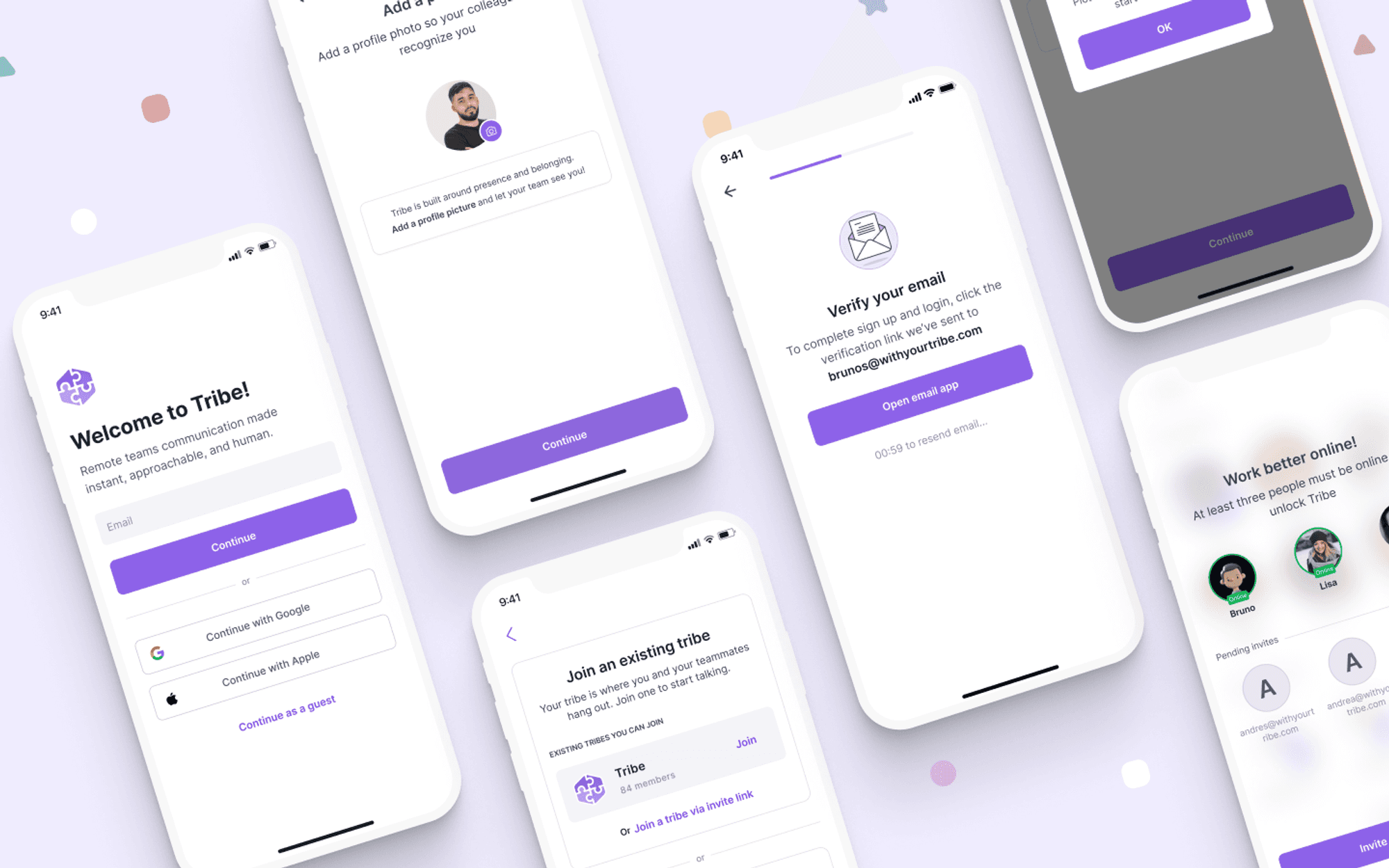
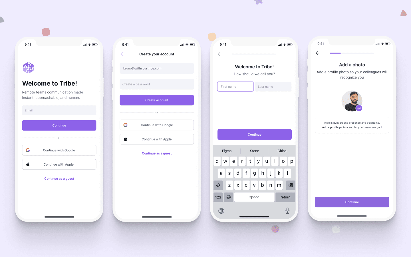
New users would be able to create their account through the app or web, or even continue as a guest to access a specific call through a link. We added a “lazy validation” process, as user would have a week to validate their emails, cutting the risk of them leaving the app during the sign up and not coming back.
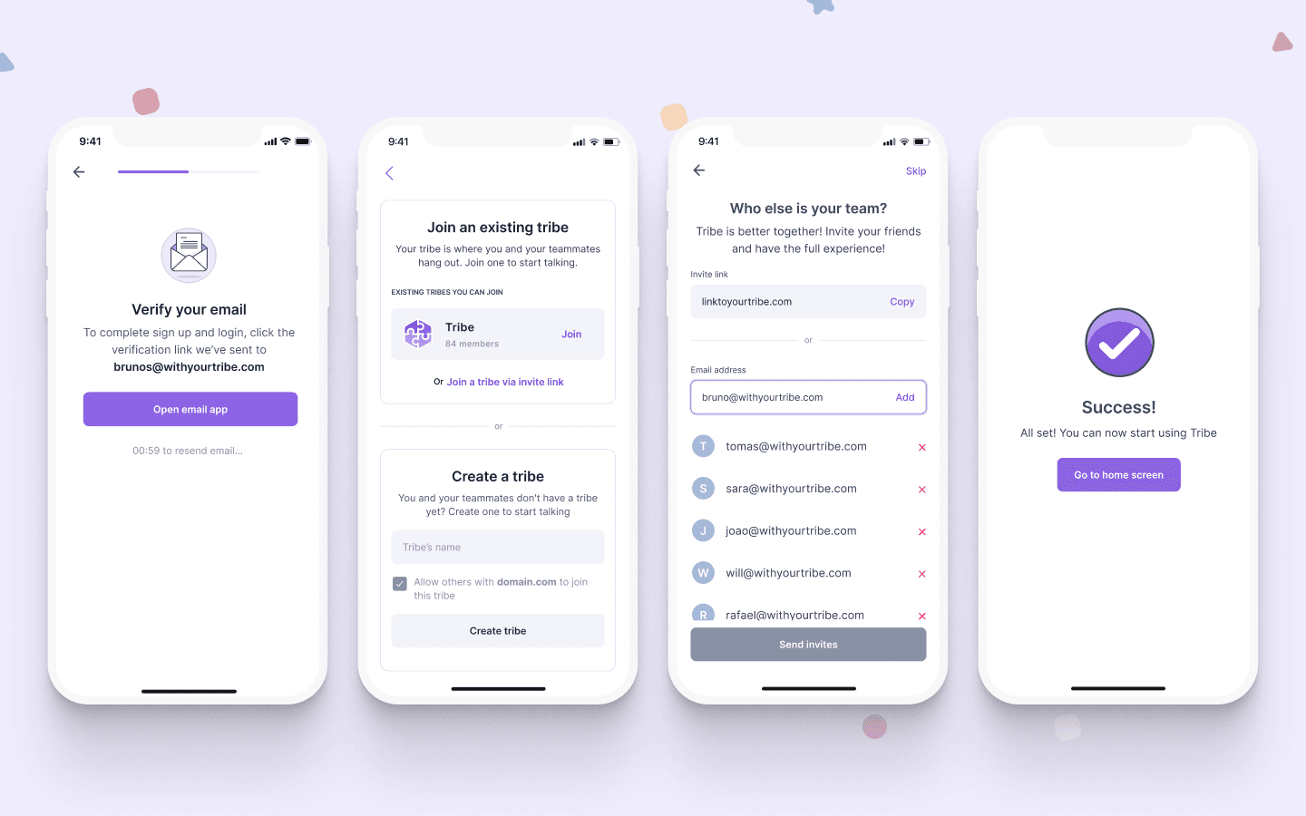
Account created, users had to join a tribe or create their own new tribe to start using the app. For the first option we added domain recognition to facilitate users lives - as the person who created the tribe would be able to allow other users with the same @domain.com to join the tribe - or join with an invite link.
With their Tribe created, it was time for the users to start inviting users to their tribe and then voilá! You’re ready to go!
Testing
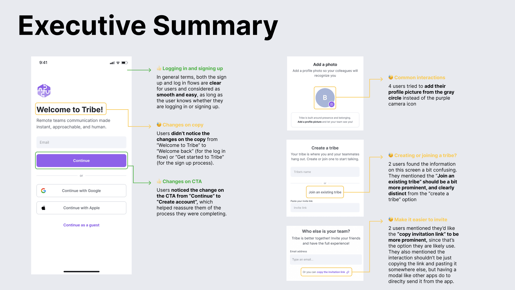
Before rolling it out to the dev team, we wanted to test the clarity and usability of the new login and sign up flows. It was decided on doing a unmoderated usability test with 10 non-users recruited through UserBob.
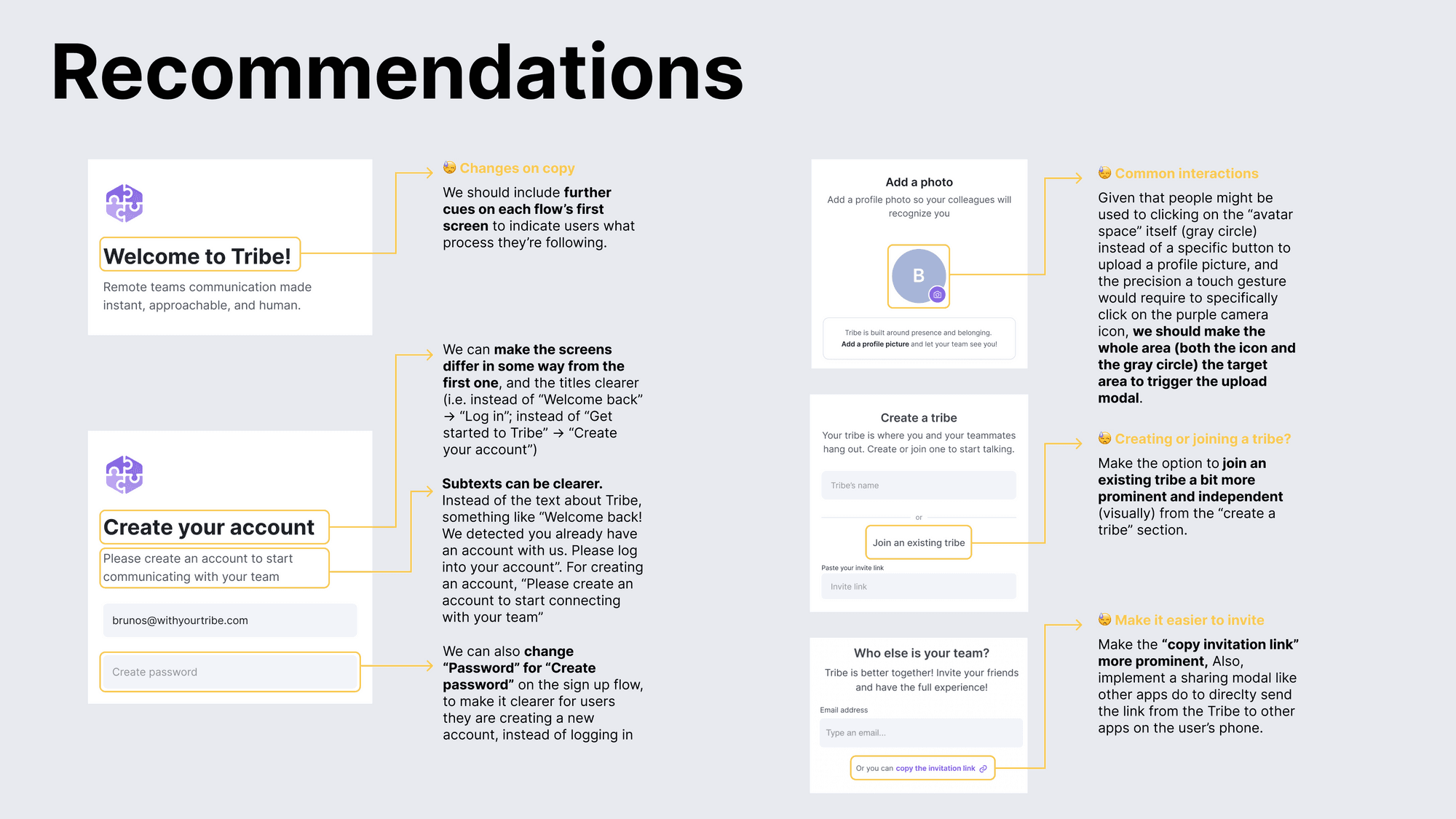
After a couple days of testing, we could gather some important data to improve the final solution, we summarized them in a summary and further recommendations.
Final note
Improvements applied, the solution was handed over to the development team and went live only a week after it. Since them, a couple more iteration were made based on further user feedback. By the time of the writing of this case, this is how it looked like.
My role
On this 2-week sprint project I joined an UX Researcher, gaining valuable insights from desk research and user testing. However, when it came to design, I took the reins and ran the entire process solo. From crafting wireframes and iterating on prototypes to designing the final interface. I felt this project was worth sharing as how fluid and efficient the proccess went.
Skills
Wireframing
Prototyping
Visual Design
User Testing
Figma
